Sense and Simplicity
Adding simple elegance to a family home
Category
RESIDENTAL
Year
2021
Location
mumbai, MAHARASHTRA
Category
RESIDENTAL
Year
2021
Location
mumbai, MAHARASHTRA
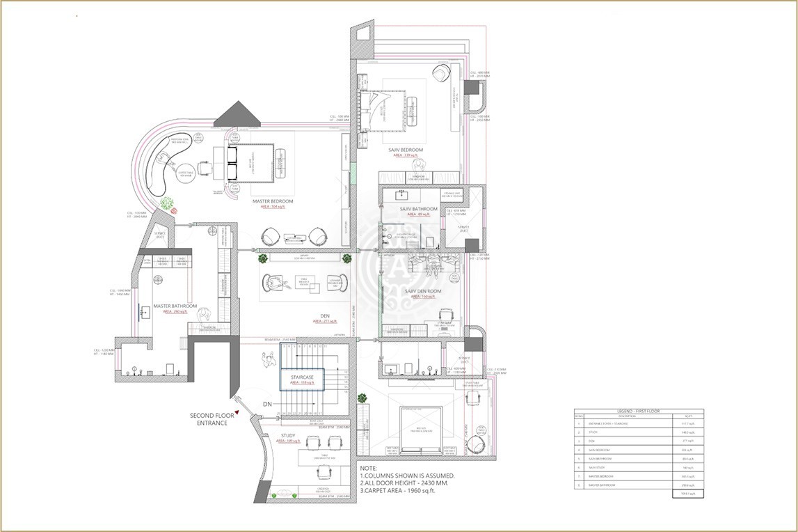
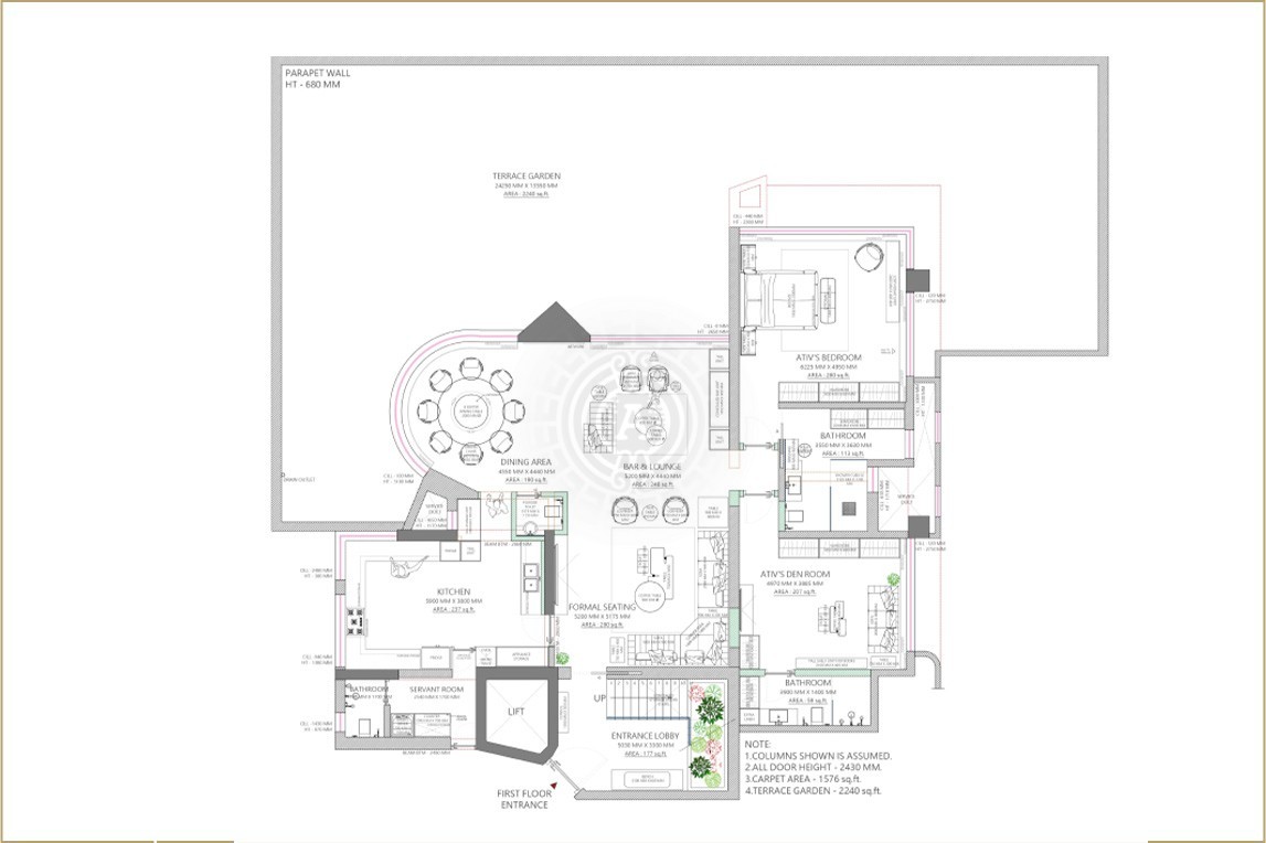
The Space
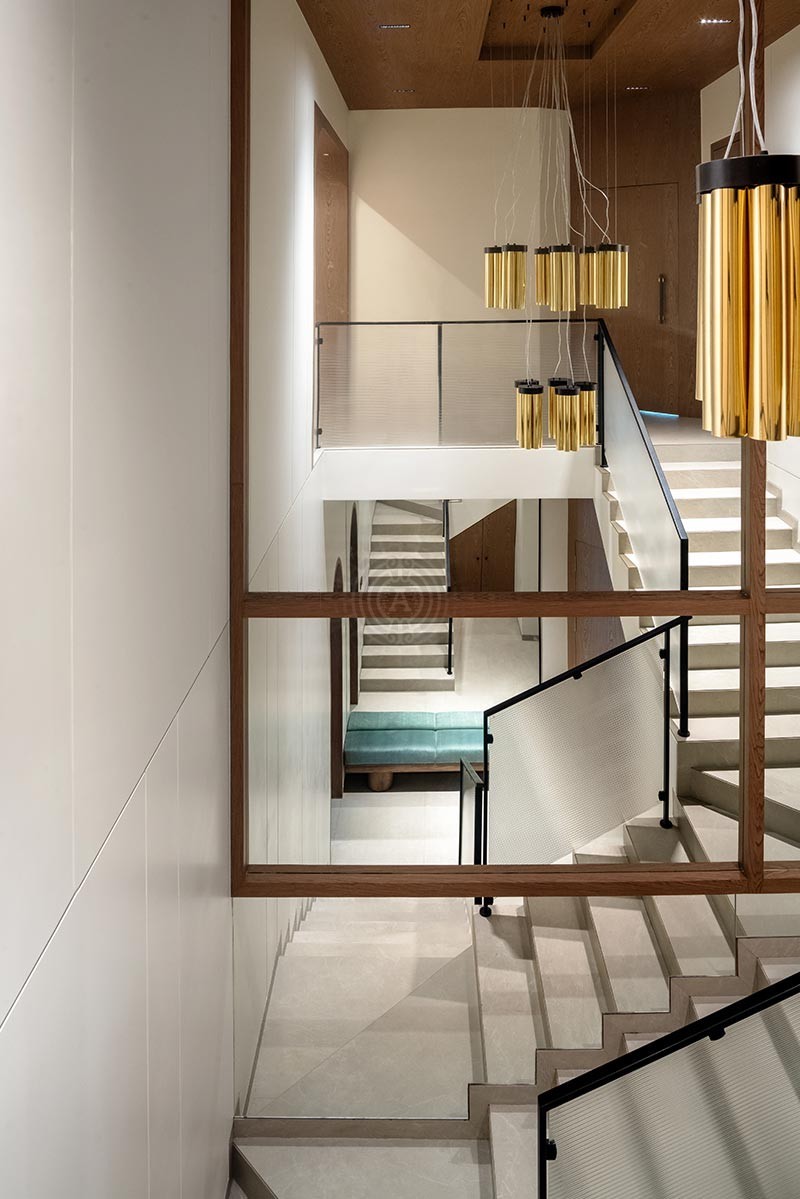
The Shah residence is an ancestral home in Juhu, Mumbai, sprawled across 6000 square feet of living space and 2000 square feet of extended space owned by a Gujarati family.
The Ask
The place had not been renovated for the last 25 years and was in dire need of it.
The ask was clear to us a few minutes into a conversation with the client - they had an extremely simple taste, and wanted the space to resonate with it; it needed to exude a similar, quietly elegant aesthetic.
The Result
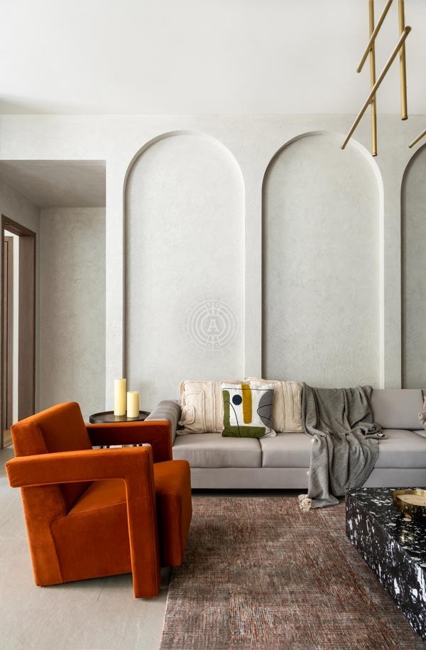
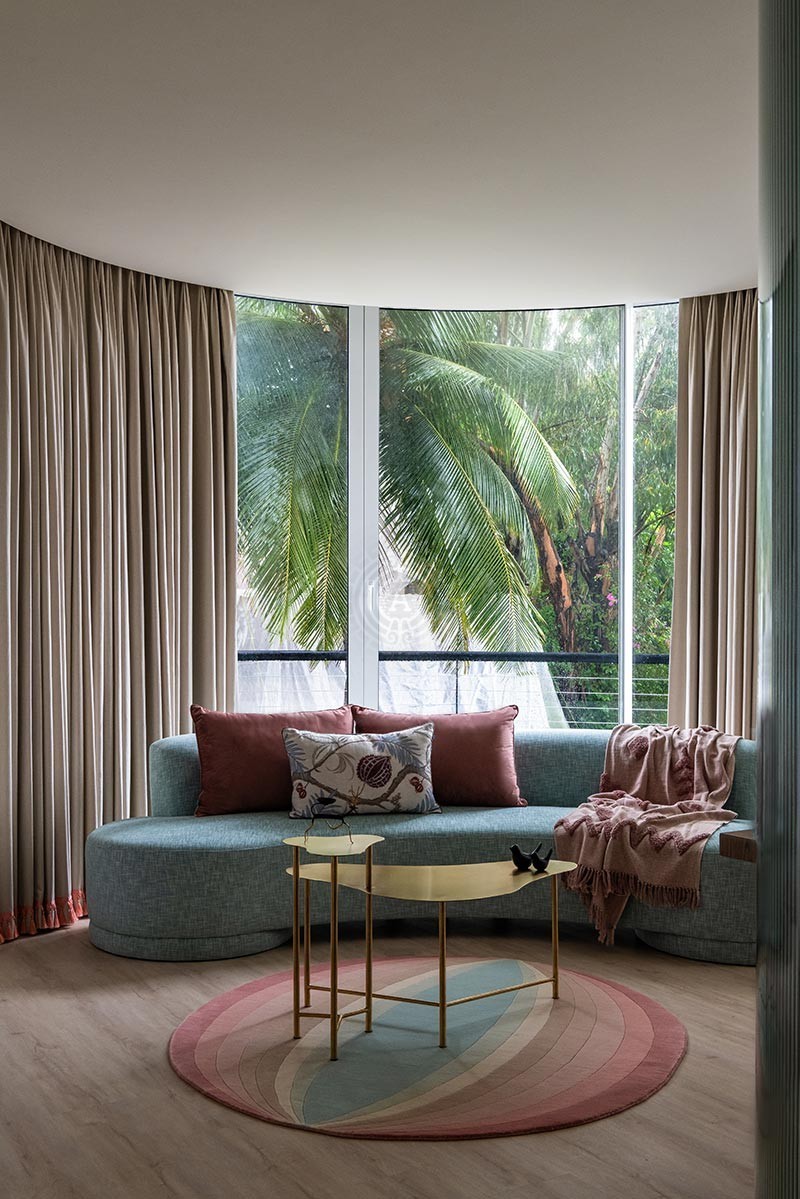
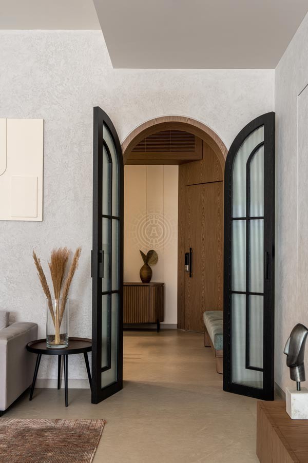
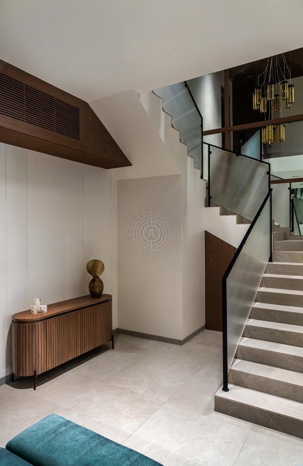
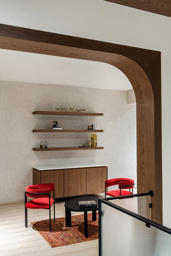
As soon as we walked into the space, we were mesmerised by the sheer grandeur of the place. The house had a great volume. As a Bombay designer, you are restricted by the house area, more often than not. But at the same time, we know how to make the space feel bigger by optimising the volume. A 200 sq ft room with a low ceiling and a 200 sq ft with high ceiling gives you a completely different feeling. For the Shah residence, we had a 14 ft high ceiling which we further accentuated by building arches along with walls. This made the ceiling look even higher.
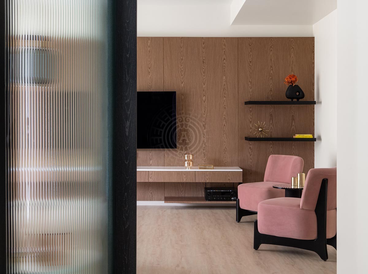
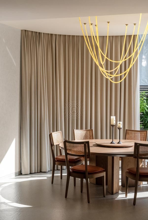
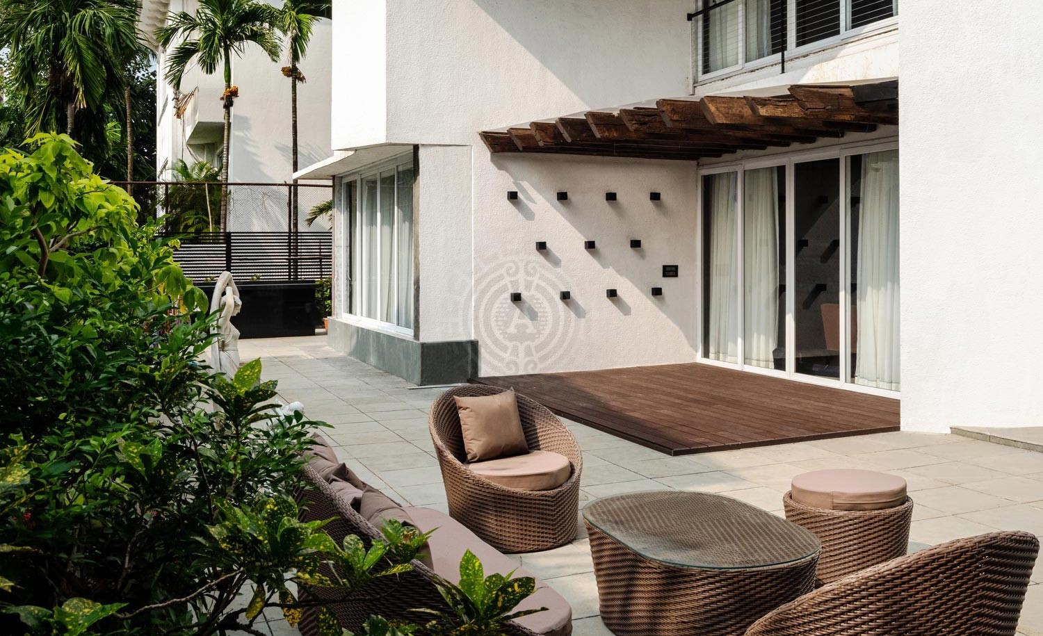
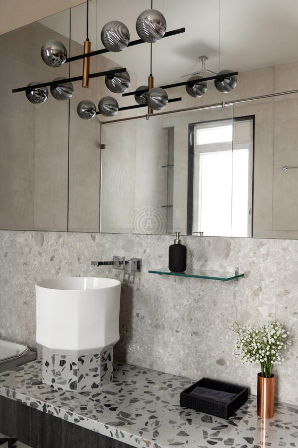
The place has a history of its own and that made it an even more interesting project. Our client did not want anything flashy or gaudy in their space. Every member of the family had a very simple taste and we respected their choice. We used blue and grey as the primary colours for the walls. Apart from that, we used a simple palette and elegant materials to give the space a new look. The family also includes a dog, which we kept in our mind while designing the exteriors.
Doing up a home like this was immensely satisfying for us and when the clients finally saw the space at the surprise housewarming party we threw for them, it was evident they loved it too!
Looking to elevate the aesthetic of your space?
Have a question for us? Let’s talk.
For all project inquiries, please email [email protected] and [email protected] with the subject NEW PROJECT.

